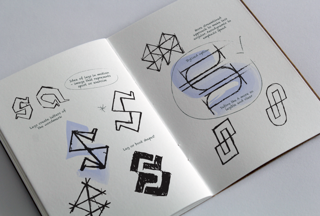
This is design done the traditional way. Pencil and paper, numerous iterations and then onto the computer to create visuals. Then a process of elimination and refinement before the big reveal!
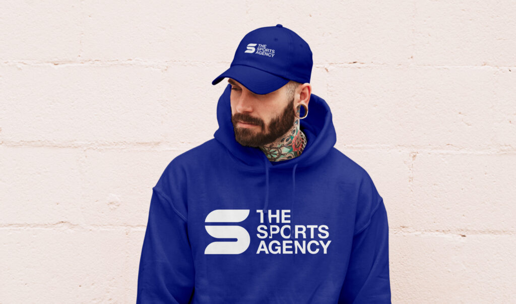
My brief was to create a strong, sports-style motif that could be applied to apparel for sponsorship and advertising purposes. The client is a new athlete management and representation agency called The Sports Agency.
My concept sketches began with an abstract graphic of legs in motion. I wanted a recognisable image that would symbolise sport and as the idea evolved it became a wordmark using the main initials (SA). This required a process of simplification to make the letters recognisable and visible to the eye.
The end result is a streamlined and stylised motif that translates perfectly to different media formats with a focus on sports apparel. This paired with the vivid blue colour palette and dynamic geometric pattern helps create impact for social media posts and marketing material.