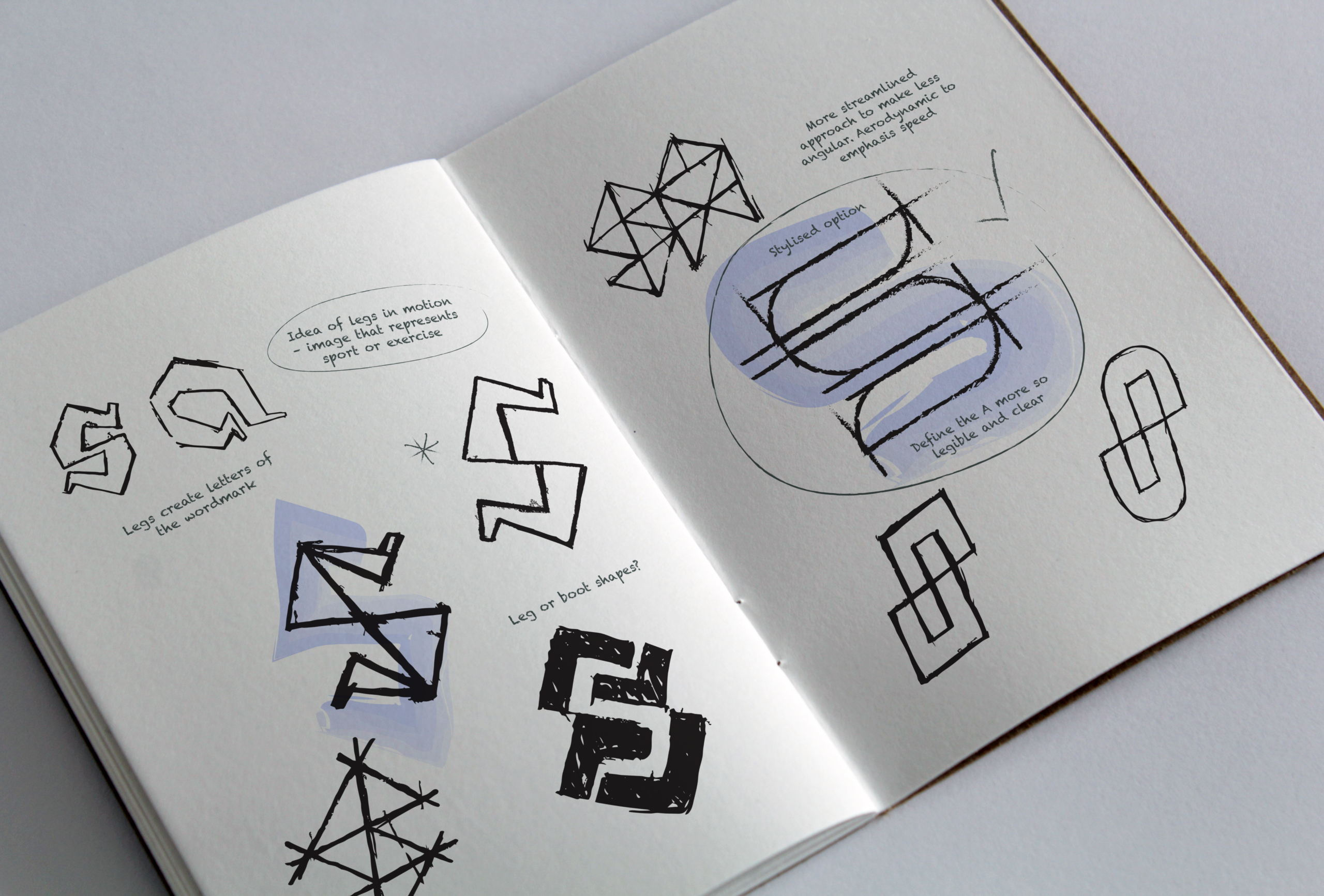
My concept sketches began with an abstract graphic of legs in motion. I wanted a recognisable image that would symbolise sport and as the idea evolved it became a wordmark using the main initials (SA). This required a process of simplification to make the letters recognisable and visible to the eye.
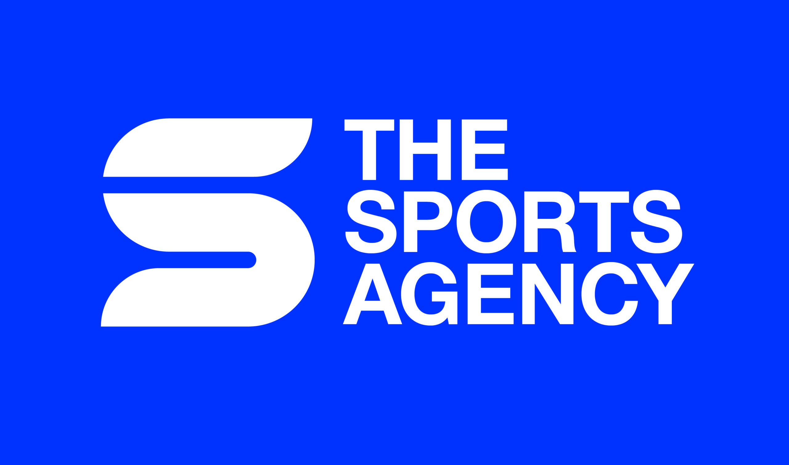
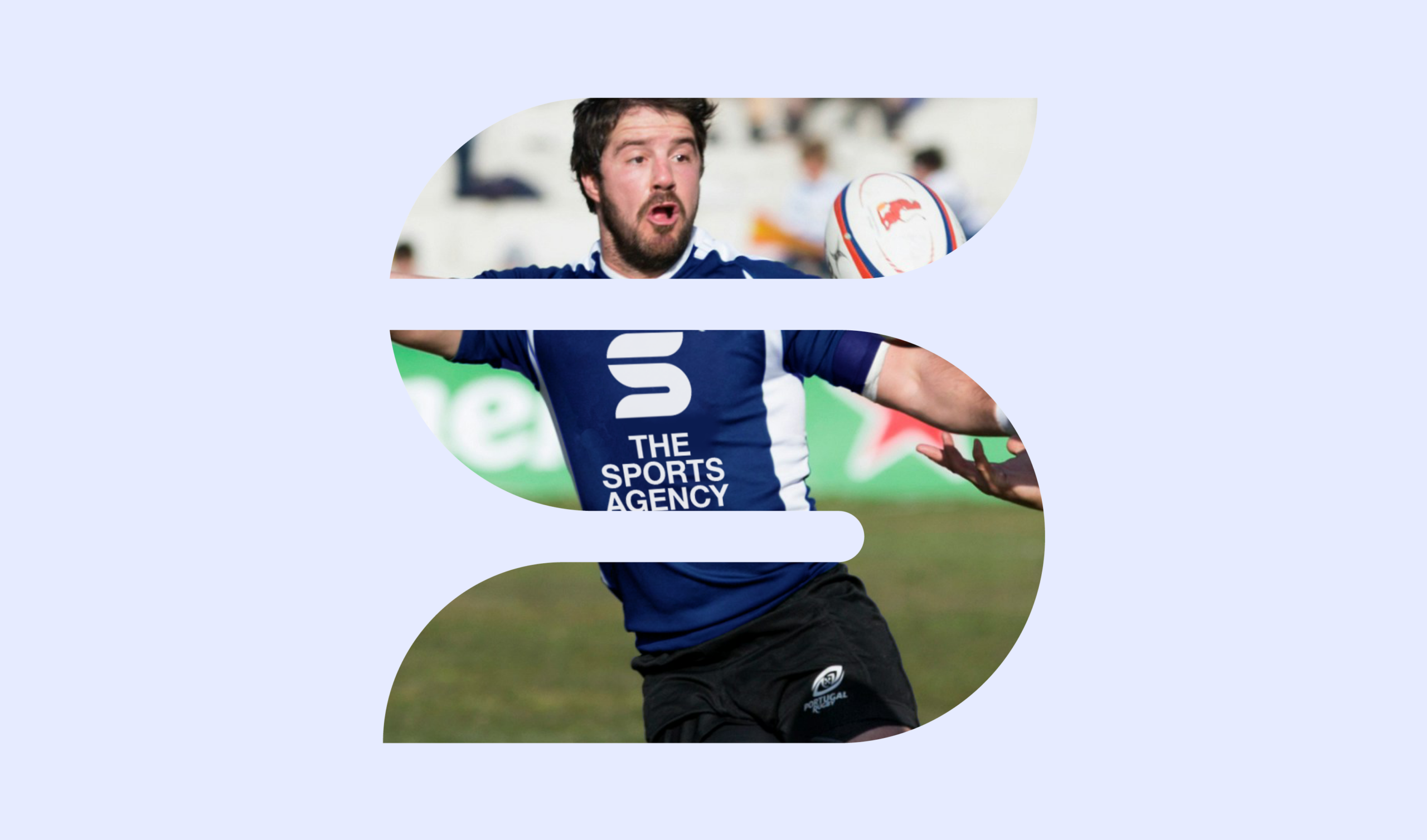
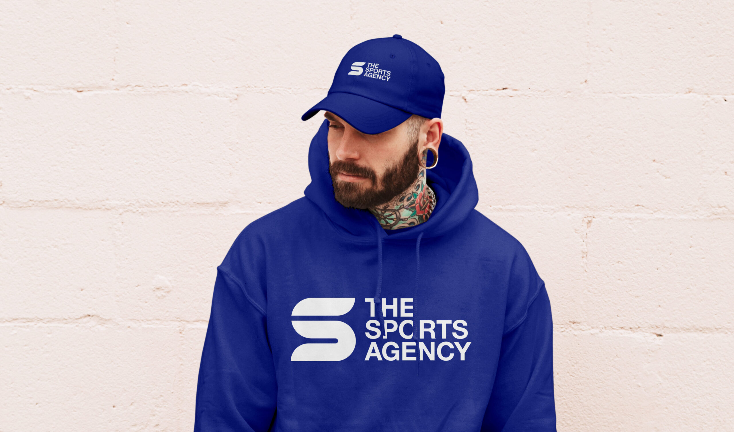
The end result is a streamlined and stylised motif that translates perfectly to different media formats with a focus on sports apparel. This paired with the vivid blue colour palette and dynamic geometric pattern helps create impact for social media posts and marketing material.